Transformation
Before and after transformation thumbnail, clear split composition, bright result side, short bold hook.
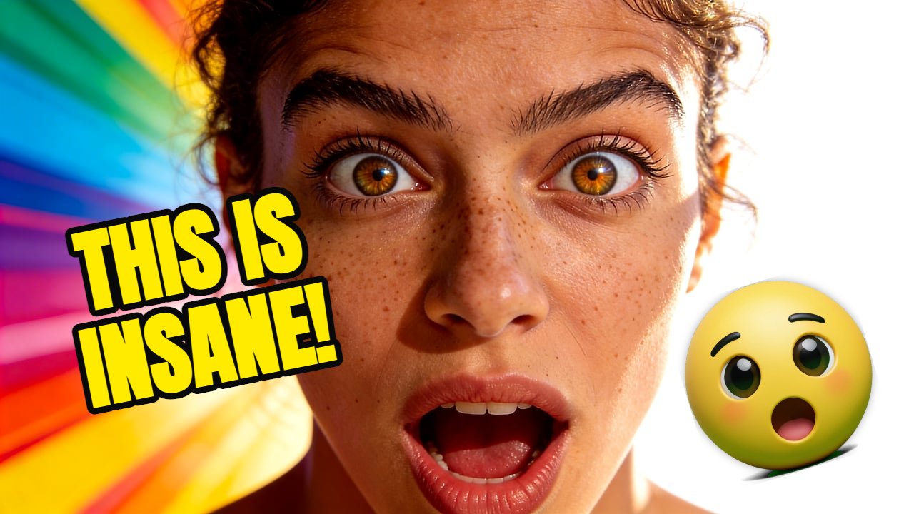
Learn practical YouTube thumbnail rules: one focal point, short text, strong contrast, mobile readability, and fast AI-assisted iteration. For creators looking for practical thumbnail strategy before generating or editing their next image.

Thumbnail strategy
Clickable thumbnails are not just louder. They are clearer. Use one focal point, one promise, and a layout that still reads when YouTube shrinks it.
01
One clear focal subject
02
Short readable text
03
Contrast that works on mobile
04
Fast AI variation testing
Live Demo
Watch the full workflow — from upload to finished YouTube thumbnail in seconds.
Drag image here or click to upload
PNG, JPG, WebP up to 10 MB
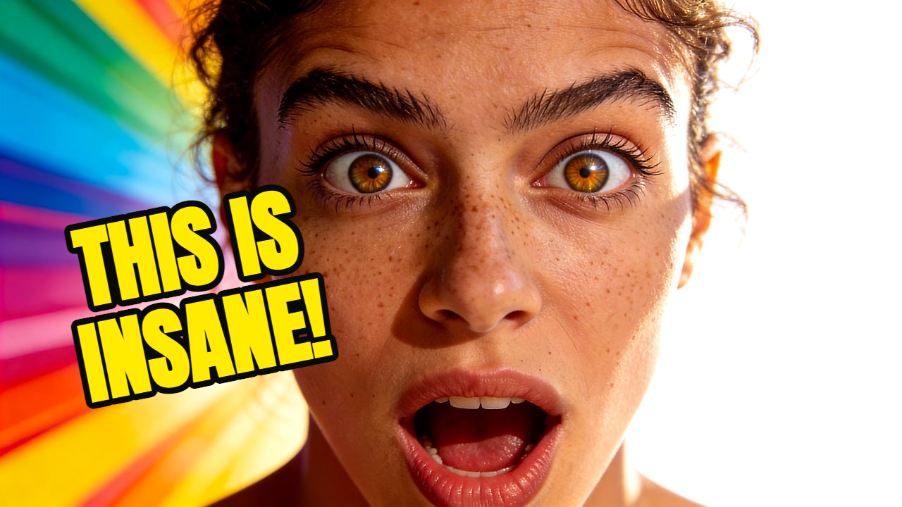
Result
Your thumbnail will appear here
Start a generation to see the result
Before choosing colors or text, decide why someone would click. Is it surprise, curiosity, transformation, conflict, proof, or a specific outcome?
A thumbnail should not explain the whole video. It should make the viewer understand the core moment fast enough to stop scrolling.
Generate multiple directions, then pick the clearest one. The best thumbnail is often the one that still works when you squint or shrink it.
Prompt examples
Before and after transformation thumbnail, clear split composition, bright result side, short bold hook.
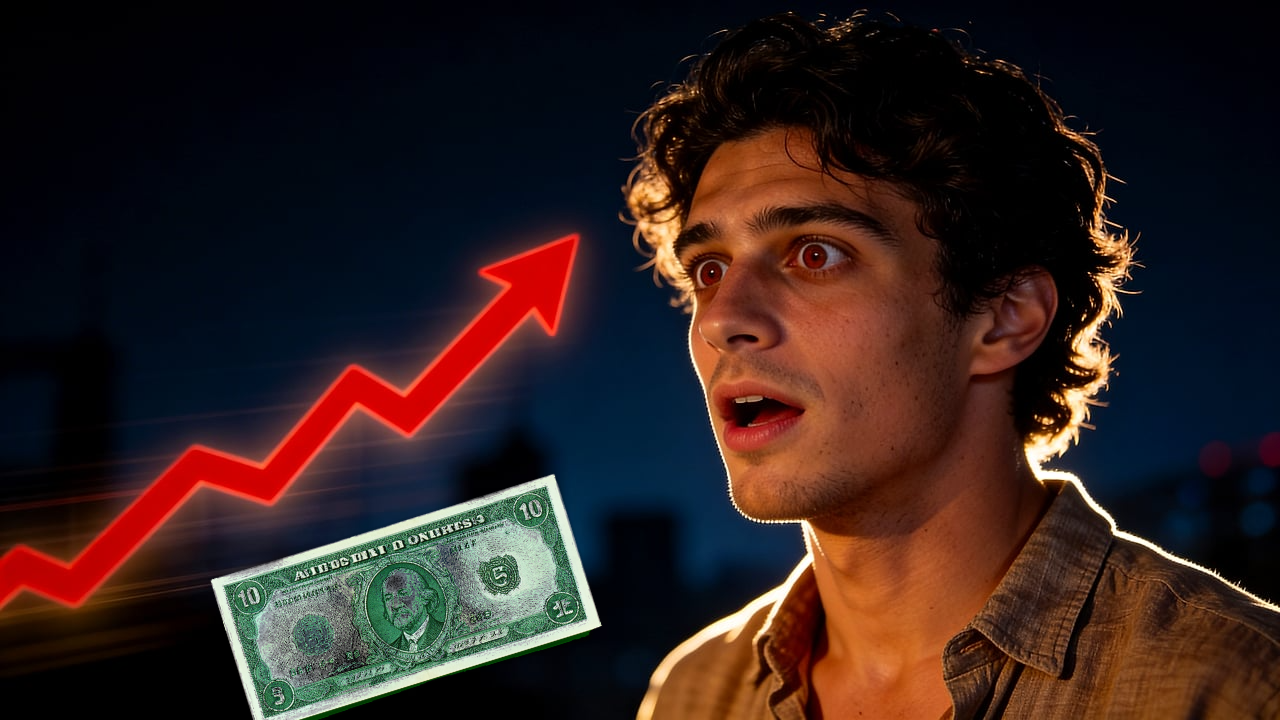
Mysterious object reveal, creator reaction, dark cinematic background, bright focal glow.
FAQ
A clickable thumbnail usually has a clear focal point, emotional or practical tension, strong contrast, and text that can be read quickly on mobile.
Use as few as possible. Three to five words is often enough, and many strong thumbnails use no text at all.
Yes. AI is useful for generating visual directions quickly, but the final choice should still be based on clarity and audience fit.
Thumbpilot